At Caju, our main challenge was preparing the HR Platform to scale alongside new product offerings. To achieve this, we restructured the navigation and split deliveries into MVPs, ensuring a more modular approach that could easily accommodate future functionalities and enhance the user experience.

Goals
Our primary goal was to identify what wasn’t working well in the current solution, address user and business needs, and create a more flexible product architecture. By making the portal more modular, we could introduce new features and meet more complex demands as Caju’s product lineup expanded.
Methodology & Process
Initial Research (SUS)
We ran the System Usability Scale (SUS) to evaluate users’ perception of the platform’s ease of use. Our initial baseline score was 77, which provided insights into areas with potential for improvement. Additionally, the SUS feedback highlighted where users felt friction, guiding us toward more data-driven design decisions.
Card Sorting
I conducted Card Sorting sessions with team members from different areas at Caju and HR professionals who use the platform daily. This helped us refine the navigation structure in a way that made sense for the actual workflows and day-to-day needs of HR teams.
Tree Testing
Before finalizing the new structure, we validated it with a Tree Testing approach to measure how quickly and accurately users found specific items in the navigation. This step ensured that our proposed reorganization matched the mental models of end users, reducing the risk of confusion post-launch. We reach a success rate of 80%, validating the new architecture of the product.
Architecture Definition
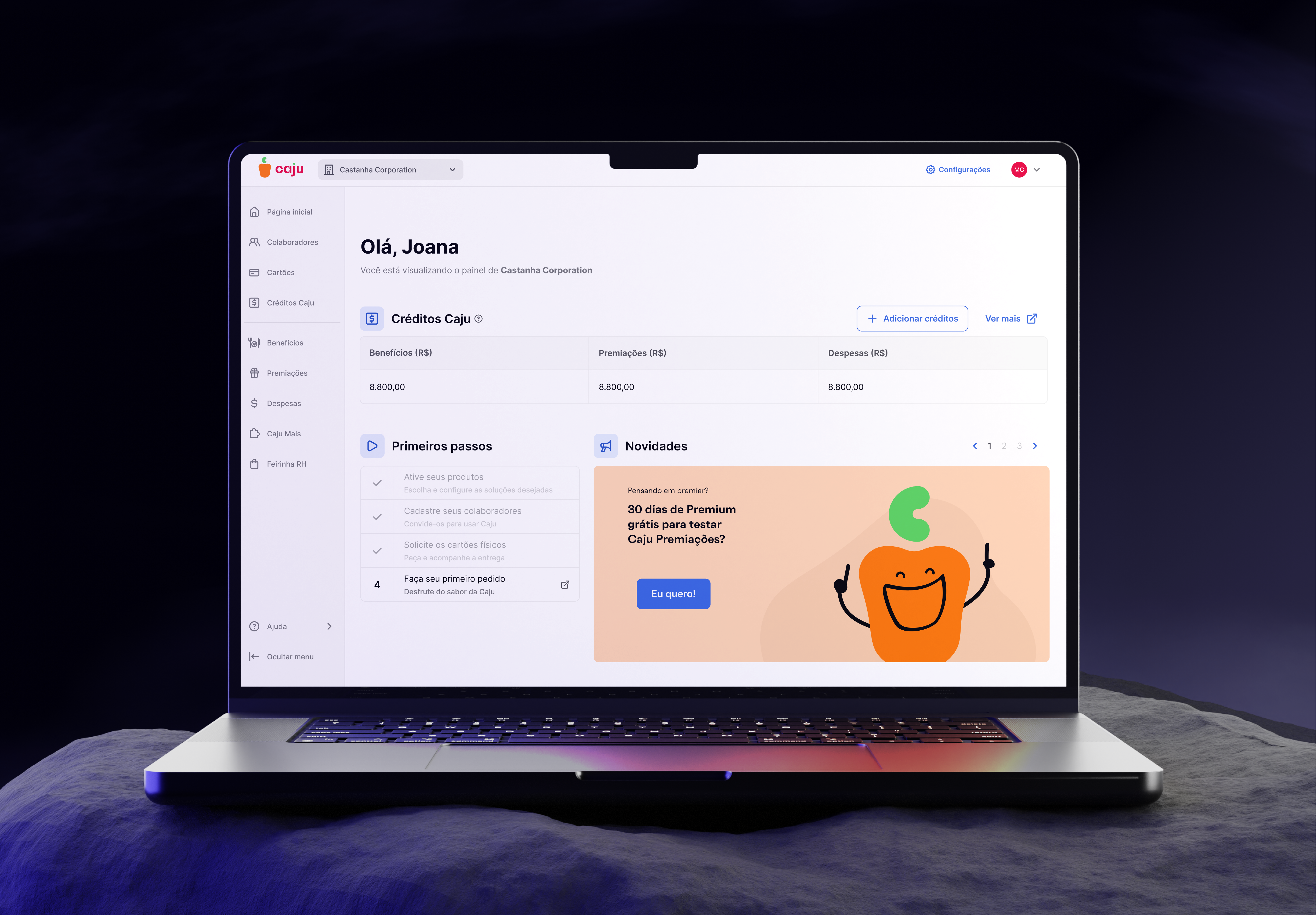
Based on the collected data, we established a three-level navigation:
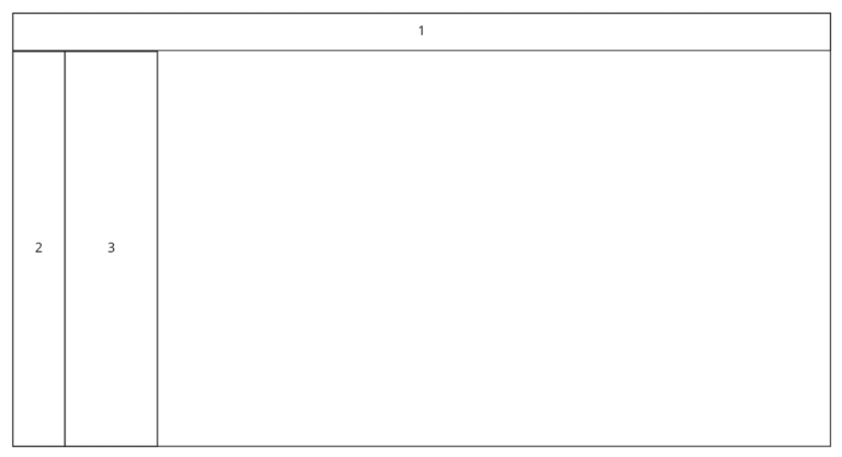
- Primary Level: A high-level view of the parent organization, allowing users to switch between companies, access group details, and manage account information.
- Secondary Level: Navigation among different products and features offered by Caju.
- Tertiary Level: Support menus and deeper functionalities related to each selected product or feature.
Prototypes & Usability Testing
We developed high-fidelity prototypes in Figma, running a round of moderated usability tests. These tests revealed a 70% success rate and a Customer Effort Score (CES) of 4.7, validating that the new approach significantly improved the user experience while also highlighting areas for refinement.
MVP’s
To track the impact of these enhancements, we broke the delivery down into small MVPs, releasing features in stages and measuring user adoption, engagement, and overall satisfaction along the way.
Phase 01
We rolled out the new menu structure to a test group, measuring how many users reverted to the old version (targeting less than 25% fallback). This provided immediate feedback on how well the redesign was received.
Fase 02
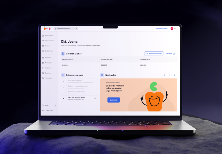
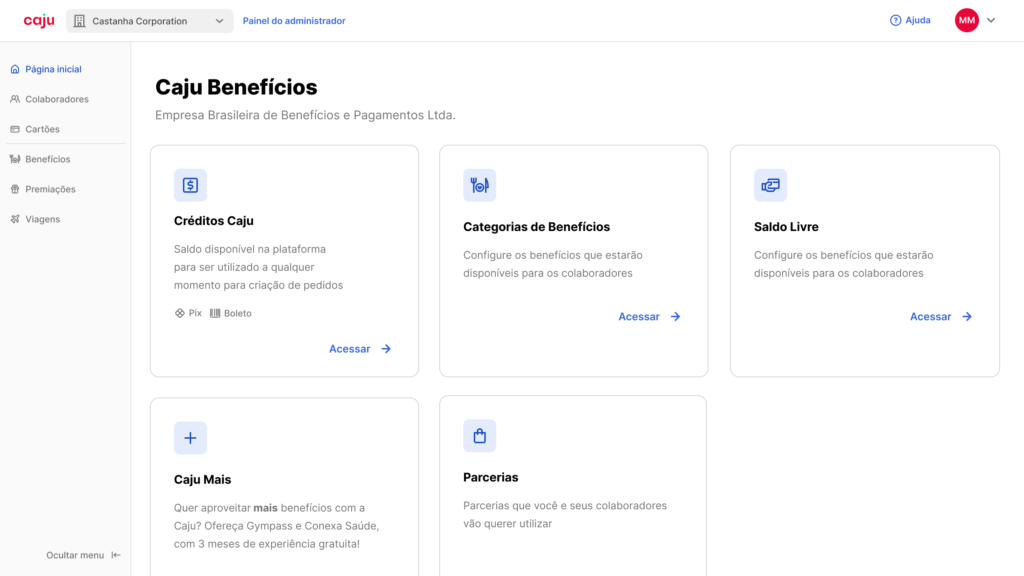
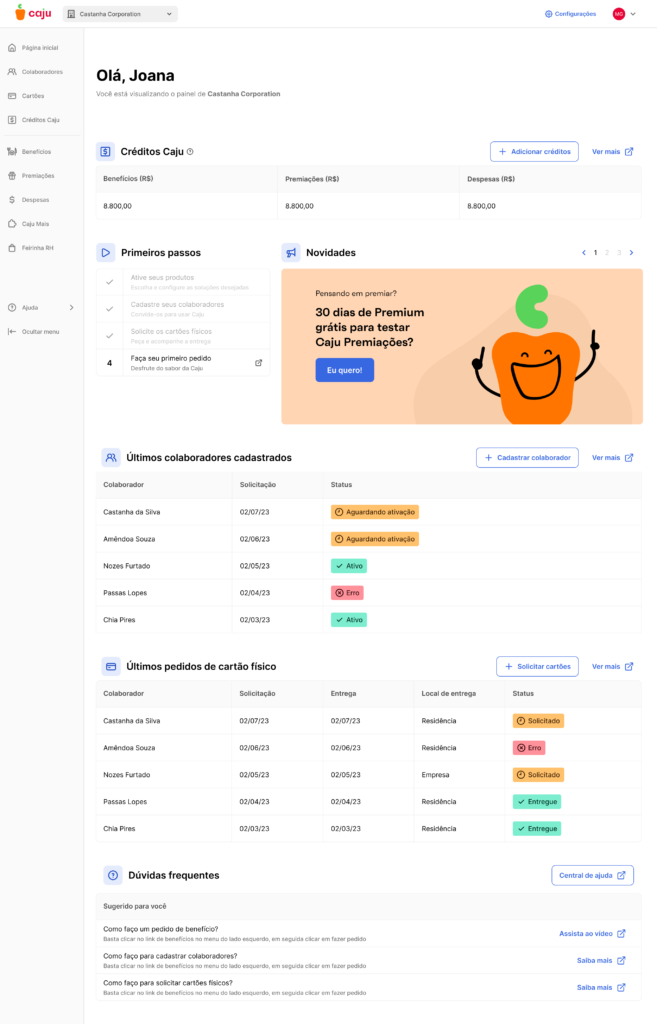
We introduced a new dashboard aimed at reducing support tickets and boosting user engagement. This included status tracking for benefits, credit details, new card orders, and an integrated FAQ—giving users a more self-service approach while lessening support overhead
Results & Impact
After implementing these changes, the HR Portal’s SUS score increased from 77 to 83, reflecting a substantial improvement in usability. Users experienced fewer friction points, and Caju benefited from reduced support calls and higher adoption of new features. Overall, the new design better aligned with both user expectations and the company’s expansion goals.
Conclusion & Lessons Learned
Redesigning Caju’s HR Portal was a comprehensive process that blended data-backed decisions, user research, and iterative releases. Dividing the project into MVPs allowed us to validate ideas quickly and evolve based on real feedback, ensuring a more scalable and efficient final product. By focusing on user needs alongside strategic business objectives, we delivered a portal that’s ready to grow with Caju’s ever-expanding product ecosystem.